
Overview
An Ideogram, available in the dash-bio set of visualization approaches, is a diagram composed of multiple bars displayed vertically or horizontally. The range of positions/indexes for a measured feature determine the relative length of the bar. A set of discrete colors defines the type or intensity of a feature along the graph.
Applications
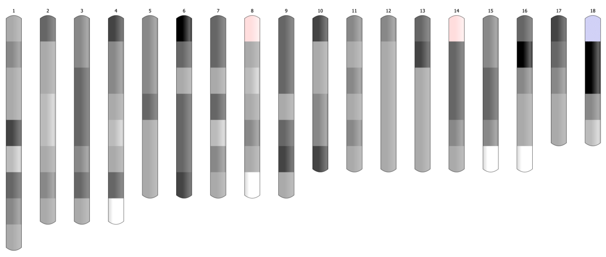
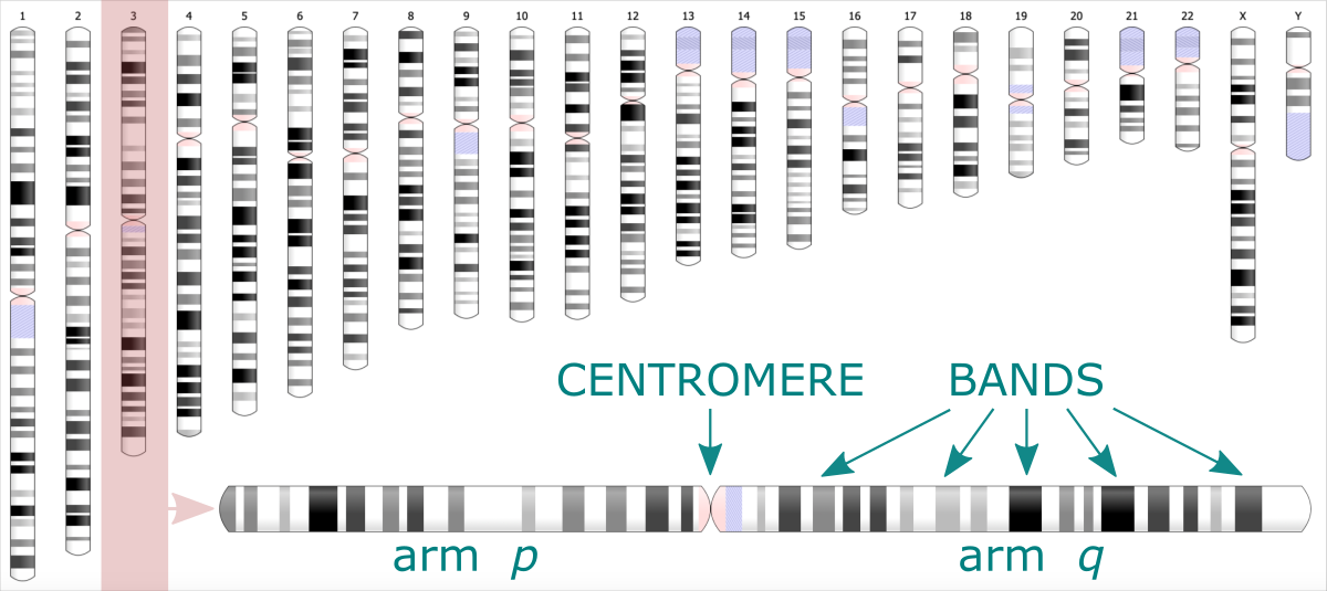
In Bioinformatics ideogram graph is used to visualize the positions of genes or microRNA along the chromosome. Easily distinguishable regions are called cytogenetic bands. The pattern of bands makes each chromosome unique. The ideogram shows the set of chromosomes of varying lengths, every split into two arms divided by a centromere.
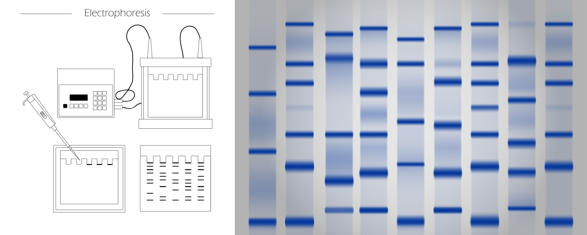
Using an ideogram, you can also visualize the results of electrophoresis. It is an experimental technique where the biomolecules (peptides, proteins, nucleic acids) are segregated based on their size and electrical charge. Depending on these properties, the molecules migrate through the matrix under electric current at different rates, leaving the characteristic pattern. Analyzing the location and size of bands allows for identifying the type and number of molecules.
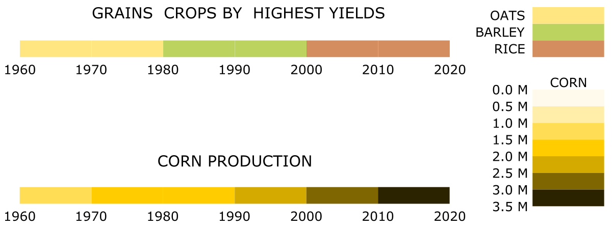
Although the mentioned are the most common applications of the ideogram, you can also use this chart type to visualize other data. Typically, it is a good choice for visualizing irregular ranges along an ordered direction. The direction can be an observation index, position, time, or any unitary variable. The difference between the highest and smallest value will determine the length of the bar. Ranges or bands along the bar visualize the pattern of the analyzed feature. Different colors may correspond to labels, categories, or feature types. For example, they can depict the species of grains crop that has given the highest yields over the decades in the last century. But also, different colors can refer to the intensity of a feature. For example, they can show how the amount of corn produced has changed over the decades in the last century.
Table. The yields [in 1000 MT] of grain crops in the United States, aggregated over decades using ISUgenomics/data_wrangling / bin_data ⤴ mini python application (usage explained in this tutorial).
1
2
3
4
5
6
7
8
     year barley    corn   oats  rice  rye  wheat
-------------------------------------------------
1960-1969  87962 1038452 136986 25047 7645 359652
1970-1979  88053 1513440  98472 34732 6345 496421
1980-1989 106060 1817012  63564 46367 5089 637308
1990-1999  83818 2192185  30834 56466 2626 644425
2000-2009  52666 2795878  16296 66408 1899 570611
2010-2019  40055 3425655   9309 64921 2265 557878
The raw data taken from the source of: Index Mundi: Agriculture ⤴ [here: example rice data]
Year Production Unit_of_Measure Growth_Rate
1960 1756 (1000 MT) NA
1961 1763 (1000 MT) 0.40%
1962 2133 (1000 MT) 20.99%
1963 2295 (1000 MT) 7.59%
1964 2386 (1000 MT) 3.97%
1965 2497 (1000 MT) 4.65%
1966 2805 (1000 MT) 12.33%
1967 2950 (1000 MT) 5.17%
1968 3459 (1000 MT) 17.25%
1969 3003 (1000 MT) -13.18%
1970 2796 (1000 MT) -6.89%
1971 2838 (1000 MT) 1.50%
1972 2828 (1000 MT) -0.35%
1973 3034 (1000 MT) 7.28%
1974 3667 (1000 MT) 20.86%
1975 4099 (1000 MT) 11.78%
1976 3781 (1000 MT) -7.76%
1977 3120 (1000 MT) -17.48%
1978 4271 (1000 MT) 36.89%
1979 4298 (1000 MT) 0.63%
1980 4810 (1000 MT) 11.91%
1981 5979 (1000 MT) 24.30%
1982 4960 (1000 MT) -17.04%
1983 3215 (1000 MT) -35.18%
1984 4382 (1000 MT) 36.30%
1985 4332 (1000 MT) -1.14%
1986 4307 (1000 MT) -0.58%
1987 4109 (1000 MT) -4.60%
1988 5186 (1000 MT) 26.21%
1989 5087 (1000 MT) -1.91%
1990 5098 (1000 MT) 0.22%
1991 5096 (1000 MT) -0.04%
1992 5704 (1000 MT) 11.93%
1993 5053 (1000 MT) -11.41%
1994 6384 (1000 MT) 26.34%
1995 5628 (1000 MT) -11.84%
1996 5453 (1000 MT) -3.11%
1997 5750 (1000 MT) 5.45%
1998 5798 (1000 MT) 0.83%
1999 6502 (1000 MT) 12.14%
2000 5941 (1000 MT) -8.63%
2001 6714 (1000 MT) 13.01%
2002 6536 (1000 MT) -2.65%
2003 6420 (1000 MT) -1.77%
2004 7462 (1000 MT) 16.23%
2005 7101 (1000 MT) -4.84%
2006 6267 (1000 MT) -11.74%
2007 6288 (1000 MT) 0.34%
2008 6546 (1000 MT) 4.10%
2009 7133 (1000 MT) 8.97%
2010 7593 (1000 MT) 6.45%
2011 5866 (1000 MT) -22.74%
2012 6348 (1000 MT) 8.22%
2013 6117 (1000 MT) -3.64%
2014 7106 (1000 MT) 16.17%
2015 6131 (1000 MT) -13.72%
2016 7117 (1000 MT) 16.08%
2017 5659 (1000 MT) -20.49%
2018 7107 (1000 MT) 25.59%
2019 5877 (1000 MT) -17.31%
2020 7224 (1000 MT) 22.92%
2021 6090 (1000 MT) -15.70%
2022 5589 (1000 MT) -8.23%
Case study
Let’s assume the corn yield data at daily frequency was collected (^365 times a year at most) for a hundred years with continuing indexing of days. Now, we are interested in identifying general periods of shortages. A change in the data structure is required before visualization to get an informative output. To begin with, we need to aggregate the data to make a more coarse-grained unit of time.
How will we aggregate the data?
Most simply by summing or averaging the data from the selected period.
How to optimize the length of the period?
Ideally, the way to highlight the significant level of feature variability.
1) In the general scenario, we could aggregate the data over every 365 input rows, slicing it into 100 annual periods.
2) In another variant, we could ask for ten periods only and estimate the number of rows merged into the data slice.
However, let’s suppose that data from some random days over the years are missing.
In this case, dividing the data into chunks based on a fixed number of rows or slices will lose the reference to time. (In the first scenario, the last period will be much smaller, while in the second scenario, all periods will be equal but still smaller than 365 days, and some days can drop into the wrong year).
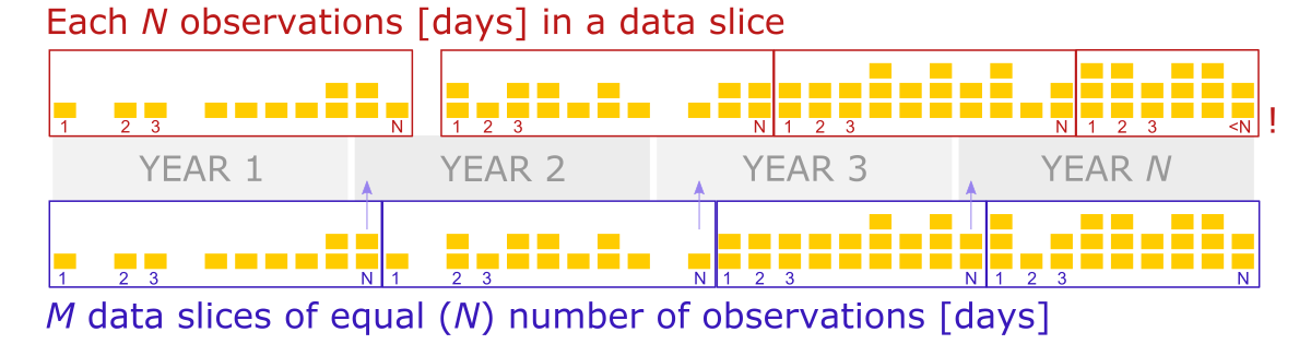
So, to solve this issue, we should create data slices based on the increment of the day counter, where days from the first year to the 100th year were indexed continually, including days of missing data.
Thus, we will take all rows whose indexes match the increment range for every slice. The value increment should be 365 to create annual periods. (So, 1-365 are days indexes for the first year, 366 - 730 for the second year, etc.).
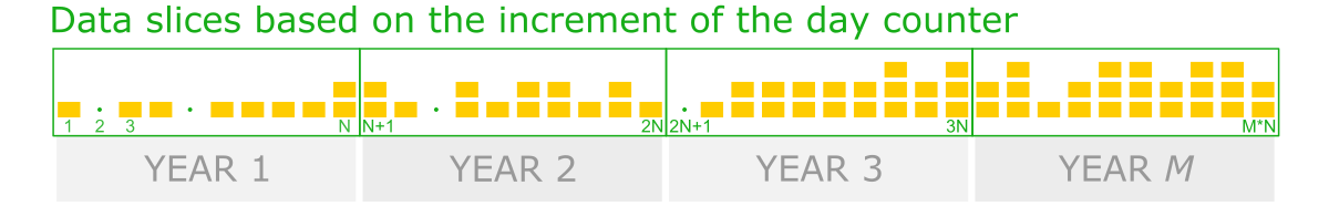
Note that in the slices where missing yields occurred, the count of the rows (days) is smaller but known. Thus, since the number of observations in periods varies, data aggregation by averaging over the data slice seems a more robust solution.
Hands-on tutorial
In this practical tutorial we will use the bioinformatic data representing genetic features of species X detected in the chromosomes of newly discovered organism Y.
Raw data
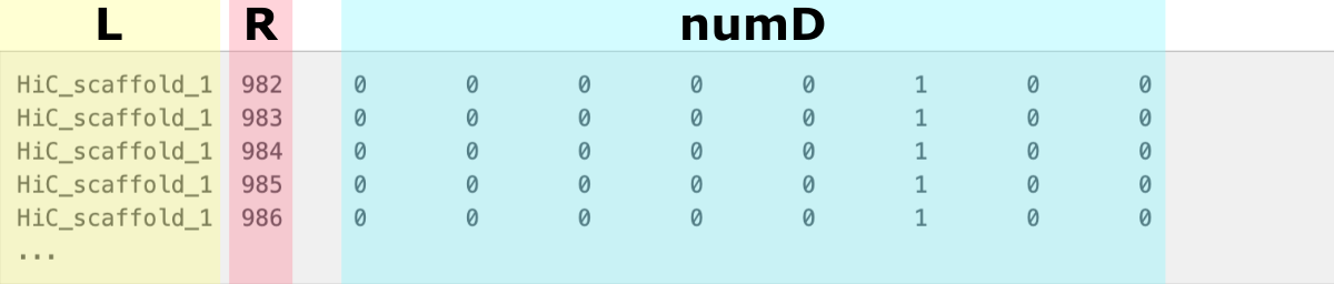
The data collected is a matrix indexed by a chromosome ID (first column) and positions along it (second column). The following numerical columns correspond to several (8) individuals of Y species. They contain an alignment depth given per position in the chromosome.
1
2
3
4
5
6
HiC_scaffold_1  982     0       0       0       0       0       1       0       0
HiC_scaffold_1  983     0       0       0       0       0       1       0       0
HiC_scaffold_1  984     0       0       0       0       0       1       0       0
HiC_scaffold_1  985     0       0       0       0       0       1       0       0
HiC_scaffold_1  986     0       0       0       0       0       1       0       0
...
Ten chromosomes are of interest to us in total, each of the lengths (number of positions) specified in the second column.
1
2
3
4
5
6
7
8
9
10
HiC_scaffold_1 73700
HiC_scaffold_2 46643
HiC_scaffold_3 39042
HiC_scaffold_4 17063
HiC_scaffold_5 47495
HiC_scaffold_6 44324
HiC_scaffold_7 114593
HiC_scaffold_9 13668
HiC_scaffold_8 22968
HiC_scaffold_10 41740
Assuming the raw file comes contaminated with results for other scaffolds, we will keep only the rows that match the chromosome list for the Y organism.
1
for i in `cat scaffold_list | awk '{print $1}'`; do grep $i"\t" < raw_data.txt >> input_data.txt; done
The resulting file input_data.txt will be used as a direct input for the data aggregation step.
Bin Data app
To process the input_data.txt file we use a ready-made Python application bin_data ⤴, available in the ISUgenomics /data_wrangling ⤴ repository.
Get bin_data.py script directly
You can learn more about the bin_data.py ⤴ app from the comprehensive tutorial Aggregate data over slicing variations ⤴ published in the Data Science Workbook ⤴. You will find there:
- the application Overview ⤴
- description of the Algorithm ⤴
- documentation, including Requirements ⤴ and Options ⤴
- examples of generic Usage ⤴
- Hands-on tutorial ⤴, including 6 detailed case studies
❖ General Approach
Before we aggregate data over data slices, first, we need to split it into chromosome-based data chunks. To do so, we can use the column with chromosome IDs, referred further to as label-col. Then, each data chunk will split into custom-size slices using the increment of values of the column storing positions, referred further to as ranges-col. Finally, numerical data-cols (columns of different traits) will aggregate for every slice by calculating the sum or mean.
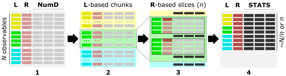
The figure shows the main steps of the bin_data algorithm.
The optimal data structure requires:
L - label-col, a column of labels, HERE: chromosome IDs
R - ranges-col, numerical [int, float] column of ordered data characteristic, HERE: positions along the chromosome
numD - data-cols, any number of numerical columns that will be aggregated, HERE: traits 1-8.
The figure shows the data structure of input_data.txt. The L column stores chromosomes IDs and is used to create label-based data chunks. The R column stores positions along the chromosome and is used to create slicing ranges. The numD columns are numerical data that will be aggreagted over slices.
This step is implemented in the bin_data.py Python app.
❖ Aggregate observations over value increment
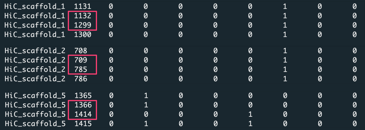
When you look closely at the data, you notice that some positions along the chromosomes are missing in the matrix.
Because of that, aggregating data over a constant number of rows [-t 'step'] or splitting data into a fixed number of slices [-t 'bin'] will lose the reference to exact positions along the chromosome. Thus for such a dataset, we aggregate observations over value increment [-t 'value'], where the value is the positions column.
In this case, we request to aggregate data with increment X [-n X] of position values. For example, with increment X=1000, the first data slice is created from position 1 to 1000, the second from position 1001 to 2000, etc. To detect the most optimal slicing increment, we should consider a few variants of X. Note the average length of the chromosomes in the input file (significantly truncated) is several tens of thousand, so a good choice is setting X to 100, 1k, and 10k (would be millions for a full-length chromosome).
Considering data for some indexes are missing, the number of input rows (counts) may vary among slices. Since the lack of data is random, we can not be sure if these positions would be significant in detecting the trait. Therefore, it makes more sense to average data over slices [-c 'ave'] instead of summing it [-c 'sum']. To make sure numerical results round to a meaningful number, let us keep three decimal places [-d 3].
Run bin_data.py app in the command line:
Get bin_data.py script:
on your local machine.
Run the program following the command:
1
python3 bin_data.py -i input_data.txt -l 0 -r 1 -t 'value' -n 100 -c 'ave' -d 3 -o 'output-value_ave_100'
In addition to the aggregated data output (output-value_ave_100.csv), the application will generate a CHUNKS directory where it writes chromosome-based chunks of raw data. You can use these files as input in the repetitions of the analysis, such as in the X-increment optimization. That will definitely speed up the processing of Big Data inputs.
Preview or get the CHUNKS folder
1
2
3
4
for X in 1000 10000
do
    python3 bin_data.py -i ./CHUNKS -l 0 -r 1 -t 'value' -n $X -c 'ave' -d 3 -o 'output-value_ave_$X'
done
Preview of the output-value_ave_10000 with data aggregated over slices cut with X=10k units in the ‘position’ column. The trait’s values were averaged for rows in every data slice, and the number of rows is given in the ‘counts’ column.
1
2
3
4
5
6
7
8
         label,   position,val-2,val-3,val-4,val-5,val-6,val-7,val-8,val-9,count
HiC_scaffold_1,  982-10982,0.591,0.567,0.048,0.000,0.380,0.822,0.074,0.359,1373
HiC_scaffold_1,10982-20982,0.803,0.642,0.238,0.326,0.895,1.057,0.000,0.456,2025
HiC_scaffold_1,20982-30982,0.107,0.000,0.000,0.052,0.507,0.378,0.000,0.085,672
HiC_scaffold_1,30982-40982,0.471,0.000,0.417,0.000,0.206,0.007,0.000,0.000,427
HiC_scaffold_1,40982-50982,0.865,0.697,0.152,0.228,0.410,1.276,0.151,1.030,1279
HiC_scaffold_1,50982-60982,0.313,0.217,0.332,0.082,0.362,0.497,0.034,0.033,2042
HiC_scaffold_1,60982-70982,1.580,1.008,0.204,0.288,0.776,1.593,0.455,0.195,1768
Visualize using ideogram
Once the data is aggregated to different coarseness, it is time to adjust the format for visualization on the ideogram.
An ideogram is a diagram in which we have only one dimension for a numerical variable. This is the index or position along the bar.
So how can you display aggregated data for individual traits?
We need to convert the numerical values into colors used for regions bounded by the position ranges (referred further as bands).
How to do it?
First you need to choose a scale composed of discrete colors. Then, each color needs to be assigned a range of values that correspond to it.
How can you map values to colors?
First, you need to find the minimum, maximum, mean, and standard deviation values for the trait’s aggregated data. Assign values around the mean for the color corresponding to the center of the scale. Then, gradually adjust values between minimum and mean for the lower part of the color scale and values between mean and maximum for the upper part of the color scale. The number of value ranges should correspond to the number of colors used. You can also depend on the standard deviation for the length of the value range for a given color.
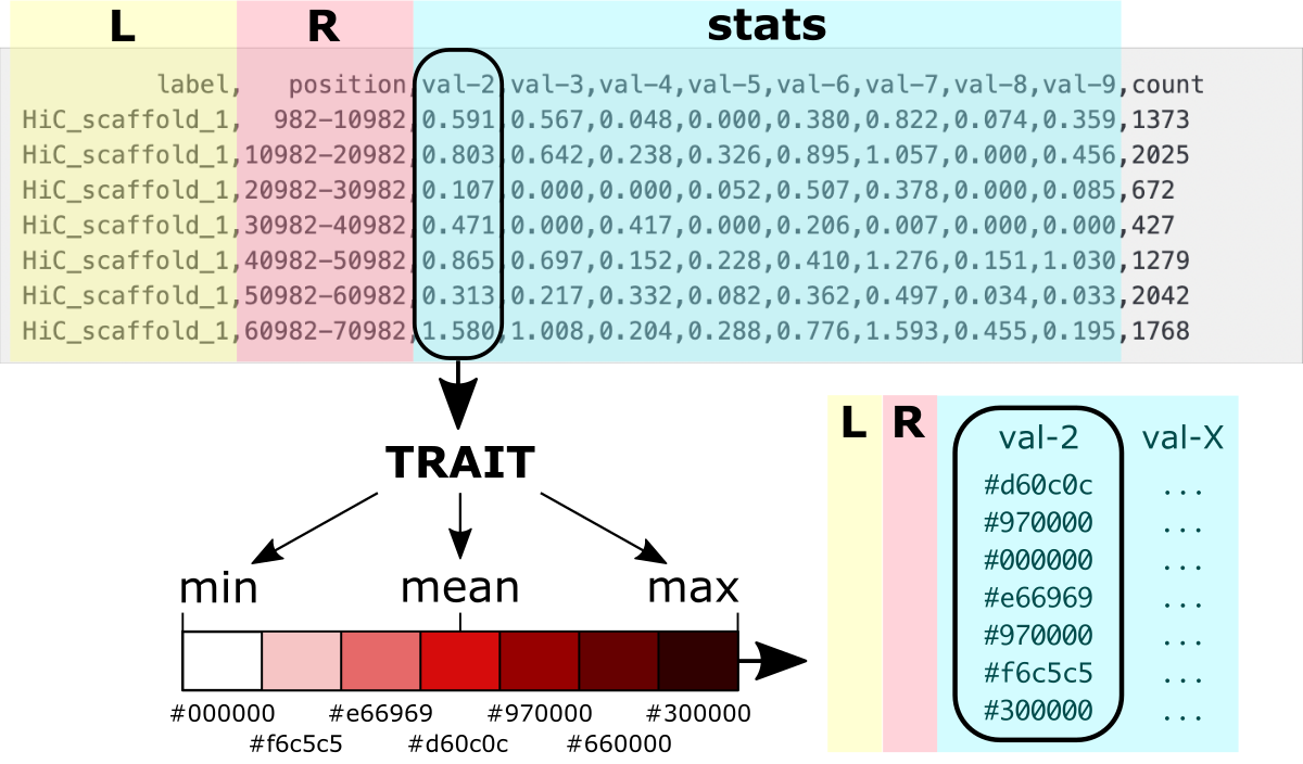
The figure shows the values to colors mapping.
Luckily, you do NOT have to implement the algorithm that will do it yourself.
Use a ready-made convert_for_ideogram.py ⤴ application in Python, moving to subsection:
A. dash-bio ideogram or
B. customizable plotly ideogram
to follow detailed instructions for converting data for visualization on an ideogram.
A. Use dash-bio variant
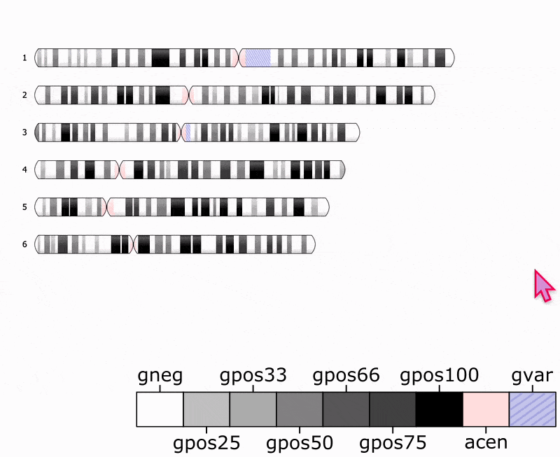
An Ideogram ⤴ visualization is available among components in the Dash Bio ⤴ module of the Dash ⤴ framework. The Ideogram ⤴ was originally developed in JavaScript by Eric Weitz ⤴ to provide chromosome visualization for the web. Further, it was encapsulated into the Dash framework for easy use by importing from the dash-bio library.
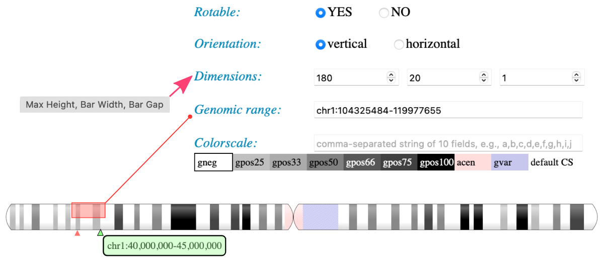
An ideogram imported from the dash-bio library makes it easy to visualize the pattern of bands on chromosomes. The application allows visualizing chromosomes for standard organisms available in an online UNPKG database ⤴. For these organisms, you can use your own annotation file. However, the approach is browser-based, and both bands and annotations data are loaded exclusively through the URL. That is a huge limitation for individual users who would like to load input directly from the file system on the local machine. To visualize your own data for a customized organism, you need to create an online database (using GitHub Pages as the simplest solution) or add files to the existing one to load data from it via URL. Another complication is the strictly defined format of the bands and annotations data files. Also, there are very limited options for coloring bands, which provides only 7 built-in gray shades (including white and black) and 2 additional colors (pink, and purple). Still, this variant of the ideogram allows for a nice interactive transition between horizontal or vertical orientation and adjusting the dimensions of the bars.
To facilitate visualizations using the JavaScript variant of the Ideogram, I built a web application using the Dash-Bio ideogram component and Dash framework. The app runs within Jupyter Notebook, and a single click opens the Ideogram interface in the separate browser tab. Then, you can select inputs and adjust visualization options using Dash widgets without the necessity of any changes in the source code.
Following the steps in this section, you will learn how to:
(1) convert inputs into the required format
(2) upload data into the online database
(3) run the app in the JupyterLab
(4) adjust visualization using the Ideogram
If you want to load customized files directly from the local file system, go to section B. Customizable Plotly-based Ideogram.
❖ Convert data structure
Chromosome bands data
The required input format for chromosome bands data is a JSON string composed of a dictionary with a "chrBands" keyword for which the value is a list of bands for all chromosomes.
1
{"chrBands" : []}
Every band is defined as a string of 8 fields separated by a single space. Subsequent strings for bands are separated by a comma.
1
2
3
4
 1 2    3   4        5   6        7      8
------------------------------------------
"1 p p1-0 982 10000982 982 10000982 gpos33",
"1 q q1-0 235 10000235 235 10000235 gpos50"
1) The first column is a chromosome ID, typically a number or letter (e.g., for a human 1-22, X, Y).
2) The second column is a chromosome arm, p or q for shorter and longer arm, respectively.
3) The third field is a custom name for a band, typically a gene name.
4-7) The fourth and fifth columns contains from and to range of chromosome positions. Usually the same range is repeated in the sixth and seventh columns.
8) The last field contains alias for the color of the band.
Convert bands data for ideogram
Use convert_for_ideogram.py ⤴ Python mini app to assign colors for value ranges. Implemented options make the application flexible to user needs. You can learn more from the documentation available in the data_wrangling/assign_colors repo and the X tutorial in the Data Science workbook.
available options of convert_for_ideogram.py:
1
2
3
4
5
6
7
  -h,       --help                       show this help message and exit
  -i input, --data-source input [string] input multi-col file
  -l label, --labels-col label     [int] index of column with labels
  -r range, --ranges-col range     [int] index of column with ranges
  -a arm,   --arms-col arm         [int] index of column with chromosome arms annotation
  -b band,  --bands-col band       [int] index of column with bands annotation (names)
  -v vals,  --values-col vals      [int] list of indices of numerical columns to have color assigned
The -i, -l, and -r options are required, so you have to specify the input file, the index of a column with chromosome labels, and the index of a column with the band’s position ranges. Note numbering in Python starts from 0. If you do NOT specify the arm column, the ‘p’ value will be assigned for all bands, and so all chromosomes will consist of a single arm. If you do NOT specify the band column, names of bands will be created automatically following the syntax arm+chromosomeID-{next_int}. If you do NOT provide the ‘vals’ list with indexes of traits columns, then by default, all numerical columns will be mapped to colors.
In our dataset, we do NOT have the information about arms and bands names. We also want to make value-to-color mapping for all traits. So, let it all be default for the purpose of data format requirements. We only specify the label-col as 0 and ranges-col as 1.
1
python3 convert_for_ideogram.py -i output-value_ave_10k.csv -l 0 -r 1
By default, the algorithm uses the mean value of a given trait to specify the ranges matching the built-in colors. So, the gpos50 corresponds to the mean, and gpos100 corresponds to the 2x mean. Pink and purple highlight bands with the highest intensity of a trait. To learn more about other variants of value-to-color mapping, see the assign_color.py ⤴ documentation.

As the output, you will get separate JSON files for all traits (8 in this example).
Preview of the resulting data-val2-10M.json file:
1
2
3
4
5
6
7
8
9
10
11
12
{"chrBands":
  [
    "1 p p1-0 982 10000982 982 10000982 gpos33",
    "1 p p1-1 10000982 20000982 10000982 20000982 gpos50",
    "1 p p1-2 20000982 30000982 20000982 30000982 gpos33",
    ...
    "2 p p2-9 285 10000285 285 10000285 gpos66",
    "2 p p2-10 10000285 20000285 10000285 20000285 gpos33",
    "2 p p2-11 20000285 30000285 20000285 30000285 gpos25"
    ...
  ]
}
❖ Upload data into the database
The next step is to upload JSON files into the online database, to access them via URL. You can add files to any website/server that provides online visibility. For individual users, the simplest solution is to create GitHub Pages ⤴ from your personal account and create indexed file struture, that will display content online.
Once you have personal account on GitHub ⤴, please follow the instructions in the Creating a GitHub Pages site ⤴ tutorial, to host a website with your database.
Note the website will be public, so the content (including your files) will be visible to anyone. If you want to visualize data directly from your file system using local server (incognito), go to section B. Customizable Plotly-based Ideogram.
Once your website is hosted online, git clone the X repository on your local machine, copy the ideogram folder into yor user.github.io repository, and git push it back on the GitHub server. Follow instructions below, to do that step-by-step.
0) If you haven’t already done so, clone your user.github.io repository.
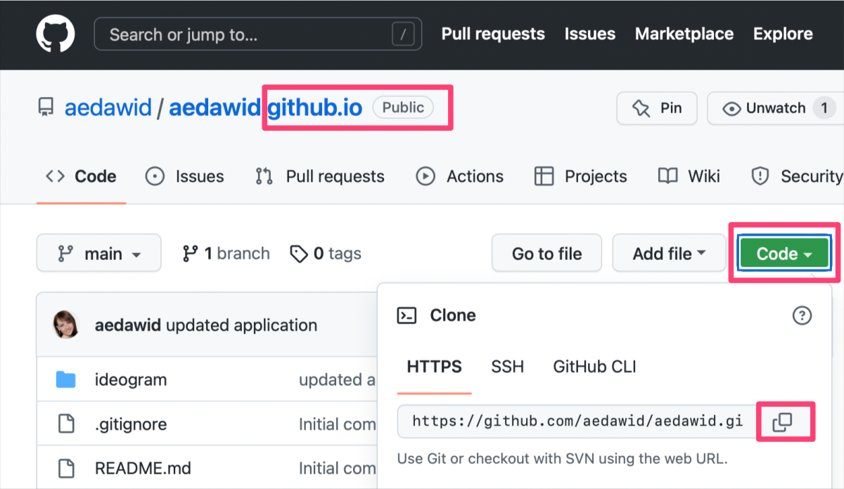
The Figure shows how to copy the URL link of a selected GitHub repository.
In the terminal window at selected location in the file system on your local machine, type:
1
git clone {copied URL}
1) Clone ideogram_db repository on your local machine.
1
git clone https://github.com/ISUgenomics/ideogram_db.git
The ls command should display both new repositories on your current path.
2) Enter the ideogram_db repo, remove .git folder, and move the remaining content into your personal repository
1
2
3
4
5
cd ideogram_db
rm -r .git
cp -r * /path/to_your_personal_repo.github.io
cd ../
rm ideogram_db
3) Navigate to your .github.io folder and make git push
1
2
3
4
5
cd path/{your}.github.io
git status
git add *
git commit -m 'added basic data structure of ideogram database'
git push
Visit your GitHub Pages online at https://{account}.github.io and refresh the website. Compare the appearance of the page with the expected result.
Copy custom data into the database
In the terminal window, copy your customized JSON data on the ideogram/database/bands path in your {user}.github.io:
1
cp path/to/JSON/data/*.json {user}.github.io/ideogram/database/bands/
Then, navigate to {user}.github.io/ideogram/ and execute run_me_before_commit.sh bash script. This step will automatically update the index of files in the database and rename them to follow the syntax custom-{int} required by Ideogram JS module. Don’t worry, you will see the original names of your files in the application interface. The list of matching pairs is in the list file on the .../ideogram/database/bands path in your {user}.github.io.
1
2
cd {user}.github.io/ideogram/
. ./run_me_before_commit.sh
The final step is to commit the updated database:
1
2
3
git status
git add {copy list of added and modified files}
git push
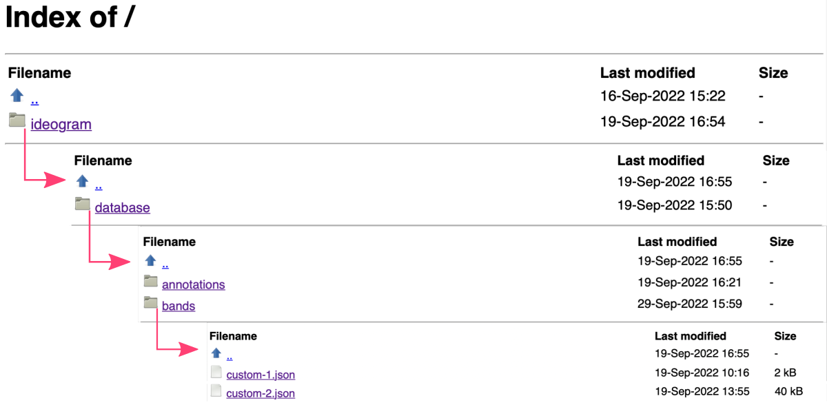
You can review the list of files hosted in your database online at https://{account}.github.io/ideogram/database/bands/.
❖ Open ideogram in JupyterLab
Requirements
jupyterlab- web-based programming environmentdash- library of widgets for web-based applicationsdash_bio- library of interactive graphs for biology tasks
The Dash-Bio graphing library has incorporated the original Ideogram module, written in JavaScript. That made it possible to call the diagram within web applications that uses efficient Python data wrangling in the back-end and user-friendly Dash widgets (options components) in the interactive front-end interface. My application is developed within the JupyterLab environment, making it robust, transferable, and easy to use daily across operating systems and web browsers.
If you are not familiar with JupyterLab yet, please follow the tutorial Jupyter: Web-Based Programming Interface ⤴ available in the Data Science Workbook ⤴.
You can install jupyterlab using pip:
$
pip install jypyterlab Then, you can launch the web-based interface from the command line:
$
jupyter lab That will open your Jupyter session in a web browser on localhost with a default URL: http://localhost:8889/lab.
You can also install the remaining requirements (dash, dash_bio) with pip directly in the terminal, making them available to the entire system. However, using the Conda environment manager will be a neater solution.
If you are not familiar with Conda yet, please follow the tutorial Basic Developer Libraries: Conda ⤴ available in the Data Science Workbook ⤴.
You can install conda following the instructions for regular installation on your operating system:
Windows ⤴
Linux ⤴
macOS ⤴
* If you need a double installation for both ARM and Intel chips on your macOS, please follow the instructions in the tutorial Installations on MacBook Pro: Install Conda ⤴ available in the Data Science Workbook ⤴.
Then, you can create a new virtual environment for interactive graphing in the command line:
$
conda create -n graphing python=3.9 activate it:
$
conda activate graphing and install required libraries:
$
pip install dash $
pip install dash_bio Once created, the environment can be found using command
conda info -e and activated when needed. Once activated, the additional dependencies can be further installed. To learn more about setting up the environment for interactive graphing, follow the tutorial Interactive Plotting with Python ⤴ available in the Data Science Workbook ⤴.
Getting started
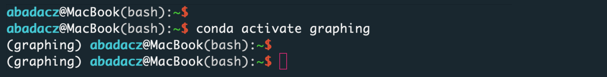
First, activate your Conda ⤴ environment dedicated to Interactive Plotting with Python ⤴:
1
conda activate graphing
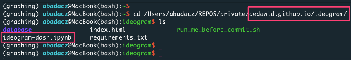
Then navigate the file system to the ideogram directory in your {user}.github.io repository.
1
cd path_to/{user}.github.io/ideogram/
Finally, launch jupyter lab from the command line and go to the web browser searching for the URL: http://localhost:8889/lab ⤴, unless it opens automatically.
1
jupyter lab
By default, Jupyter Lab shows on the browser the local file system from the level of the current directory (where it was started in the terminal). If the ideogram-dash.ipynb notebook does not start automatically in the right-hand panel, click on it twice (in the browser on the left-hand side). Then, from the top menu bar, select Kernel followed by Restart kernel and run all cells.... Scroll down the script and wait until the calculations are complete. Once the output cell appears on the screen, click on the link http://127.0.0.1:8050/. In the new tab in your browser, it will open the interactive interface of the Ideogram application. Switch the web tab and adjust options for your inputs and diagram dimensions. Hovering on the options’ labels displays the extended instructions and descriptions.
Use custom bands and annotations
The ideogram-dash application provided in the ISUgenomics/ideogram_db ⤴ repository allows you to display a diagram for data stored in any online database. By default, it uses the original UNPKG database, available at https://unpkg.com/ideogram/dist/data/ ⤴. There are bands and annotations subdirectories, respectively. Instead, you can provide a URL to your custom inputs stored in the database hosted on your {user}.github.io, created previously in step Upload data into the database ⤴ of this tutorial.
As example, I’ve created the aedawid.github.io repository, available at https://github.com/aedawid/aedawid.github.io ⤴, which is hosted online via GitHub Pages at https://aedawid.github.io/ ⤴. The page’s index allows entering the ideogram/database and displaying the example inputs for bands and annotations.
Let’s try to use this data in the interactive ideogram-dash web application:
For the option Provide URL to online bands use:
1
https://aedawid.github.io/ideogram/database/bands/
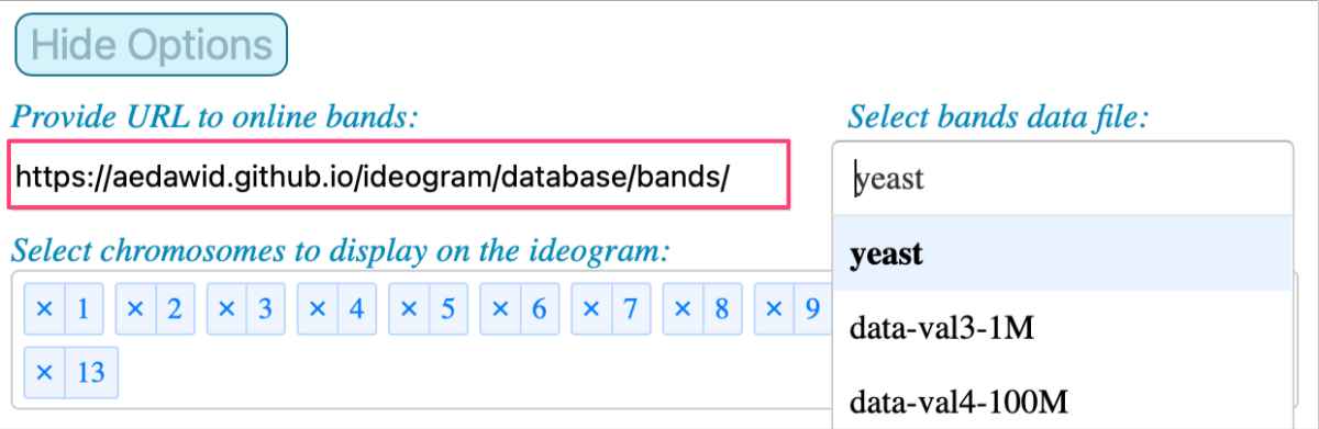
Note that the list of available inputs is updated when a new database is indicated. And when you select a file from that drop-down menu, the list of available chromosomes is updated too.
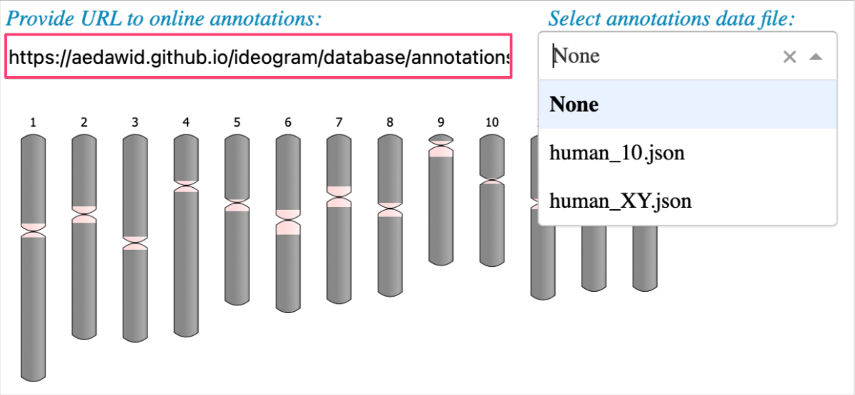
For the option Provide URL to online annotations use:
1
https://aedawid.github.io/ideogram/database/annotations/
Now it’s your turn to try your own data!
B. Use plotly variant
Section under development…