Genomescope uses k-mer frequencies generated from raw read data to estimate the genome size, abundance of repetitive elements and rate of heterozygosity.
Background
A K-mer is a substring of length K in a string of DNA bases. For example: All 2-mers of the sequence AATTGGCCG are AA, AT, TT, TG, GG, GC, CC, CG. Similarly, all 3-mers of the sequence AATTGGCCG are AAT, ATT, TTG, TGG, GGC, GCC, CCG. There are an exponentially increasing number of possible K-mers for increasing numbers of K. There are 16 possible 2-mers for DNA if we assume there are only 4 types of bases (A,T,G,C).
| A | T | G | C | |
|---|---|---|---|---|
| A | AA |
TA |
GA |
CA |
| T | AT |
TT |
GT |
CT |
| G | AG |
TG |
GG |
CG |
| C | AC |
TC |
GC |
CC |
Similarly, there are 64 possible 3-mers for DNA if we assume there are only 4 types of bases (A,T,G,C).
| A | T | G | C | |
|---|---|---|---|---|
| A | AAAAATAAGAAC |
TAATATTAGTAC |
GAAGATGAGGAC |
CAACATCAGCAC |
| T | ATAATTATGATC |
TTATTTTTGTTC |
GTAGTTGTGGTC |
CTACTTCTGCTC |
| G | AGAAGTAGGAGC |
TGATGTTGGTGC |
GGAGGTGGGGGC |
CGACGTCGGCGC |
| C | ACAACTACGACC |
TCATCTTCGTCC |
GCAGCTGCGGCC |
CCACCTCCGCCC |
The general rule for the number of possible K-mers given a sequence with 4 possible bases is the following. The number of bases (B) raised to the power of the size (length) of the k-mer (k).
B^k
| Bases | K-mer size | Total possible kmers |
|---|---|---|
| 4 | 1 | 4 |
| 4 | 2 | 16 |
| 4 | 3 | 64 |
| 4 | 4 | 256 |
| 4 | 5 | 1,024 |
| 4 | 6 | 4,096 |
| 4 | 7 | 16,384 |
| 4 | 8 | 65,536 |
| 4 | 9 | 262,144 |
| 4 | 10 | 1,048,576 |
| 4 | … | … |
| 4 | 20 | 1,099,511,627,776 |
As you can see, there are 64 possibilities for a 3-mer and over a Trillion possibilities for a 20-mer!
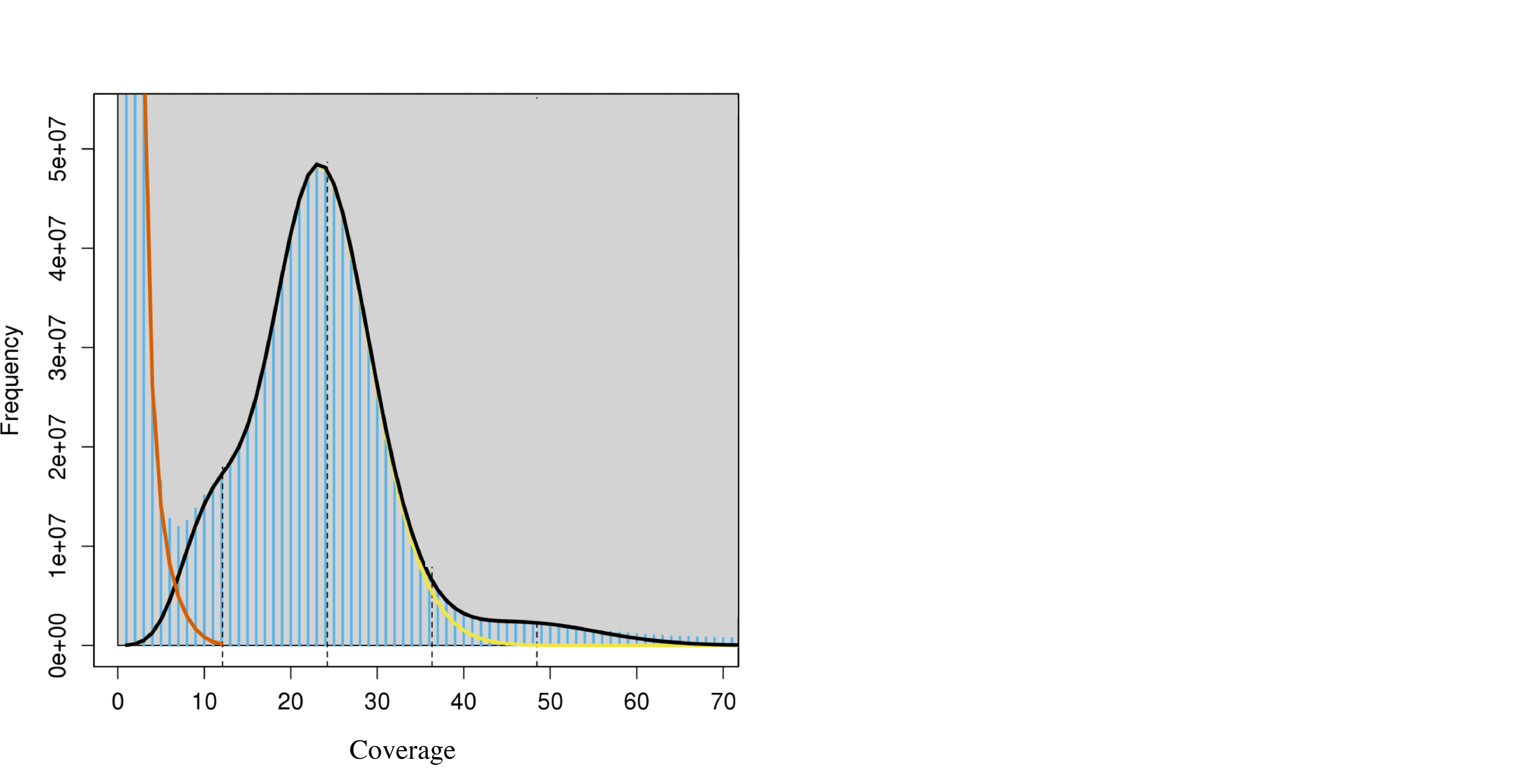
K-mer graph: estimating coverage depth of raw DNA reads for a genome using number of times a K-mer is observed (coverage) by number of K-mers with that coverage (frequency).

The peak around 25 in the plot above is the coverage with the highest number of different 21-mers. Another way to put it is that there were 5e^7 unique 21-mers (frequency) that were observed 25 times (coverage). The normal-like distribution is due to the fact that we don’t get perfect coverage of the genome. There are some regions with a little less coverage and some regions with a little more coverage but the average coverage depth is around 25.
The large number of unique K-mers that have a frequency of 1 right on the left side of the graph is due to PCR errors and works like this.
Recall from above
All 3-mers of the sequence "AATTGGCCG" are AAT, ATT, TTG, TGG, GGC, GCC, CCG.
Now consider the following sequence where I have replaced the 4th letter (T) with a C to simulate a PCR error.
All 3-Mers of this sequence “AATCGGCCG” are AAT ATC, TCG, CGG, GGC, GCC, CCG. The ones in bold are the incorrect 3-mers that are now unique and end up at the beginning of the graph we plotted above.
General Rule: For a given sequence, a single PCR error will result in K unique and incorrect K-mers
How GenomeScope works
GenomeScope extended this idea by exploring how the K-mer graph changes with increasing heterozygosity, PCR errors and PCR duplicates. They determined that the idealized K-mer graph that you understand above is the extreme case where there is low heterozygosity, low PCR errors and low rates of PCR duplicates.

The big peak at 25 in the graph above is in fact the homozygous portions of the genome that account for the identical 21-mers from both strands of the DNA. The dotted line corresponds to the predicted center of that peak. The small shoulder to the left of the peak corresponds to the heterozygous portions of the genome that accounts for different 21-mers from each strand of the DNA. The two dotted lines to the right of the main peak (at coverage = 25) are the duplicated heterozygous regions and duplicated homozygous regions and correspond to two smaller peaks. The shape of these peaks are affected by the PCR errors and PCR duplicates. The authors were able to come up with an equation (see below) that accurately models the shape and size of the K-mer graph using four negative binomial peaks which shape and size are determined by % heterozygosity, % PCR duplication, % PCR Error. All very useful pieces of information to learn about your genome from your raw data.

Understanding all the elements of the equation is less important than knowing that it represents the summation of four negative binomials (peaks) whose shape are affected by heterozygosity, PCR duplication and PCR Errors.
Creating your own GenomeScope Graph
Install or load Jellyfish onto your machine
module load jellyfish
Obtain the k-mer frequencies of your raw data (fastq) using JellyFish
jellyfish count -C -m 21 -s 1000000000 -t 10 *.fastq -o reads.jf
Then export the kmer count histogram
jellyfish histo -t 10 reads.jf > reads.histo
Note: “By default jellyfish caps the max kmer frequency at 10,000x but there can be real kmer sequence beyond that” and “Although those super high frequency kmers are also enriched for artifacts so requires a little investigation. “ – Michael Schatz See supplementary Figure 5
That file can be processed by running GenomeScope online to generate the figures described above.
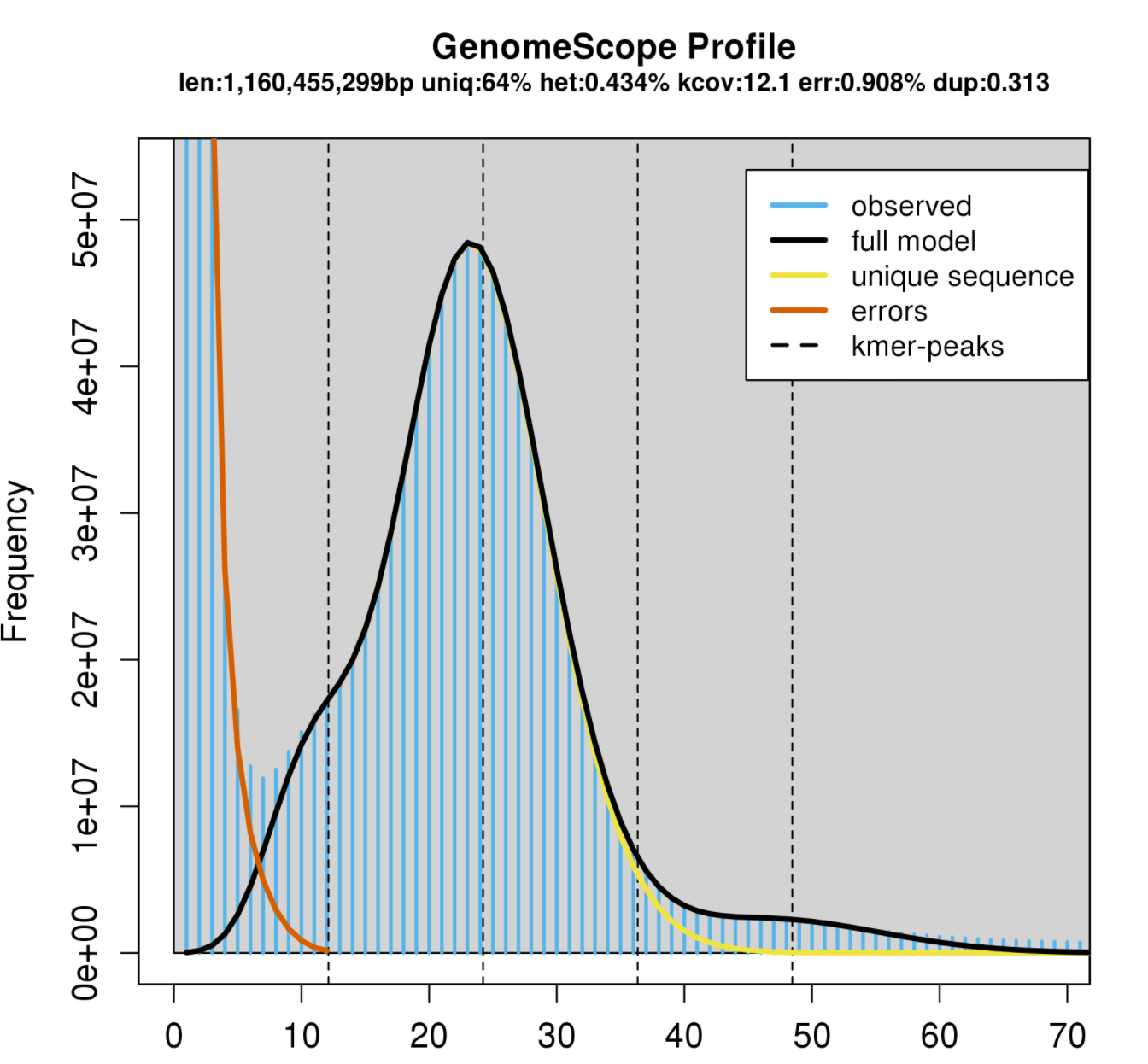
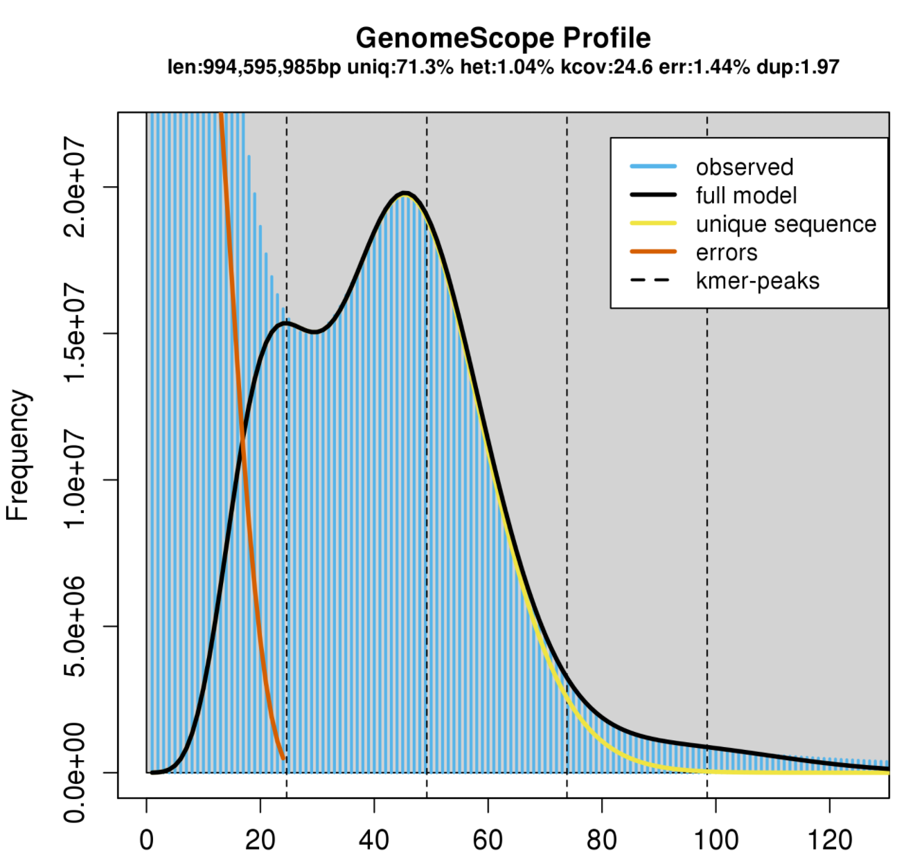
Example output interpretation White vs Black Abalone.
White

Black

First, I notice is that the genome size for these two are being predicted to be around 1GB which is a lower than I was expecting since pink, green and red have expected genome sizes of closer to 1.8 GB GenomeSizeDB
Second, I notice that there are around 65-70% unique 21-mers suggesting this genome has around 30-35% repetitive content. This means the genome could be challenging to assemble with short reads. This fits with our preliminary assembly of Paired-End only data resulting in over 10 million contigs.
Third, the heterozygosity of the white abalone is much lower than that of black abalone. This also makes sense. The white abalone samples were acquired from a white abalone farm, where as the black abalone were obtained from the wild.
Of these two individuals, the white abalone would be easier for an assembly program to assembly due to its lower heterozygosity.
For more information on how GenomeScope works, check out this poster and supplementary methods file
- GenomeScope Poster
- GenomeScope Github Page
- GenomeScope supplementary file and deeper explanation of equations
